Why are phone dimensions backwards: Height x Width ?
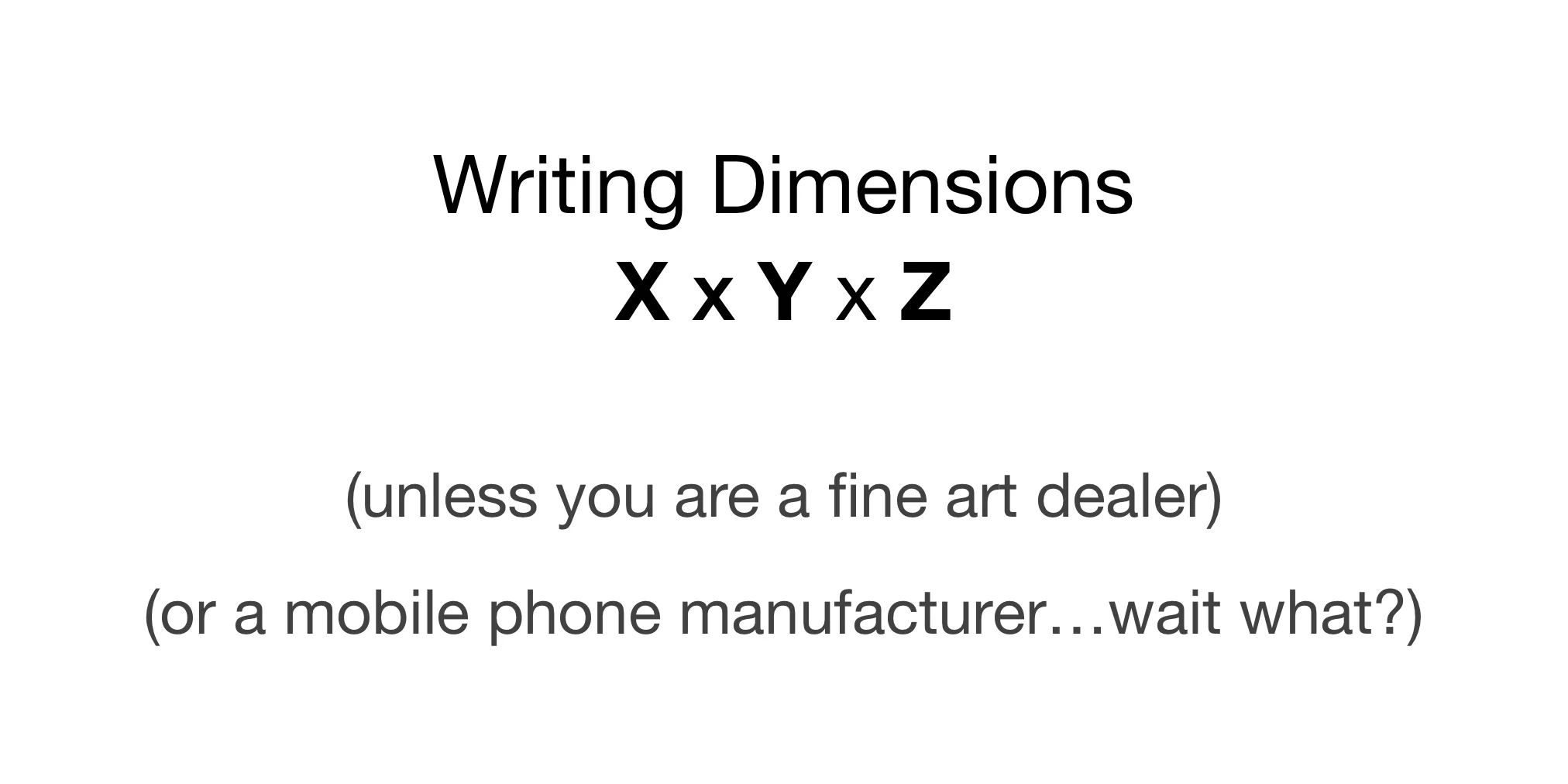
When writing dimensions most of us know from a young age that the correct order is X x Y x Z. HORIZONTAL x VERTICAL x DEPTH.
The prior blogpost (UI/UX: Writing X vs Y Dimensions) confirms this.
Why then do mobile phones advertise Height x Width x Depth ?
This seems backwards. Yet, this convention is used for both device size and screen resolution on mobile and tablets.
Listen to this post on your podcast app under: Gregory Schmidt, or on YouTube
Mobile phone dimensions
Theses Wikipedia screenshots show the dimensions of the iPhone XS and Samsung Galaxy S8. Both follow Height x Width x Depth.
The same strange H x W x D order is found on their websites
Apple Website
The screen dimensions are written 2436-by-1125-pixels. That is Height x Width.
Samsung Website
The product dimensions are written 148.9 x 68.1 x 8.0, that Height x Width x Depth. The same is found on the display resolution 2960 x 1440.
Technical guides for developers
However, when Apple produces technical guides for software developers, they reverse the display of the dimensions back to the traditional Horizontal x Vertical.
Screenshot from Apple Developer Documentation (reference link)
What about tablet dimensions?
Here things start to break down and become more interesting.
Wikipedia continues to display the tablet dimensions and the screen resolution in the order of: Height x Width x Depth. Example here from iPad 2019.
The Apple website also continues to lists screen resolution using the same order as well.
HOWEVER, look at how the image of the tablets are displayed. They are shown in landscape mode.
This essentially means Apple is now displaying the screen resolution of the tablet as Width x Height - provided you view the tablet as a default landscape device.
The iPad mini is also orientated this way in the product specs.
Although the technical specifications show the iPad horizontally, the other advertisements and iPad comparison still show it in portrait mode.
The Galaxy Tab S5e 10.5" continues to display their resolution using height x width x depth, but their product page only shows the tablet in portrait orientation.
Anyone have the answer?
I don’t know why phones and tablets record their screen resolution.
Please let me know if you do, I’m curious to find out the history behind this.
Consider also reading in this series:
Part 1 : UI/UX: Writing X vs Y dimensions
Part 2: Why are phone dimensions backwards: Height x Width ? (this article)
Part 3: Why 4K is misleading